Gói Ảnh
Có quyền truy cập vào hơn 400 triệu hình ảnh, vector, hình minh họa và những nội dung khác. Bao gồm ảnh tạo bằng AI!
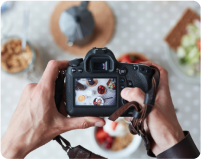
Gói đăng ký video
Thư viện gồm 28 triệu video clip chất lượng cao. Chọn giữa gói và gói đăng ký.
Gói Âm nhạc
Tải xuống từng bài một hoặc mua gói đăng ký không giới hạn lượt tải xuống.


Pastel Green
Pastel green, bright and light, evokes spring, tender new leaves, and Easter eggs. The color green is itself a mixture of blue and yellow, and it incorporates the cheerfulness and mental sharpness of yellow with the insight and peace of blue. More energetic than its cousin, mint, this particular color is brighter and more openly cheerful than many green tones. This hue is the clarion call of renewal. Being bright yet soft, pastel green pairs well with other gentle colors such as light blues, where the combination creates a peaceful, pulled-together look for a relaxing atmosphere. It also blends well with yellowish green hues. It lends a soft, nostalgic look to interiors, especially in kitchens with lots of white. Try pastel green for stools, kitchen towels, backsplashes, and even accessories such as food processors and blenders. In eating areas, paint thrift store chairs pastel green and mix and match table seating. This color shines in living rooms. Choose one large item, such as a sofa, to upholster in this color, and let it be the focal point of the room. Keep other colors mellow and neutral. As with interior décor, clothing and accessories this color hint of days gone by. Dresses, shoes, bags, and scarves all sport pastel green and help you put together a vintage-inspired but thoroughly modern outfit.
#B2FBA5
#B0FBA5
#7BB074
#ECFFE9
#D9FFD3


Find more colors
Đón nhận cảm hứng cùng các công cụ sáng tạo

Cắt nghĩa lý thuyết về màu sắc cho các nhà tiếp thị và chủ sở hữu doanh nghiệp nhỏ

Cẩm nang từ A đến Z về màu sắc trong thiết kế
Lĩnh hội tất tần tật kiến thức cơ bản để sử dụng thành thạo màu sắc trong thiết kế. Khám phá lý thuyết màu sắc, ý nghĩa chúng truyền tải cũng như các hệ màu để chọn ra bảng màu "chuẩn không cần chỉnh" cho tác phẩm của mình.

35 lớp phủ họa tiết miễn phí theo phong cách tạp chí

Bạn đã sẵn sàng để bắt đầu thiết kế chưa?
Dùng thử Shutterstock Editor, ứng dụng thiết kế đơn giản và hiệu quả. Tạo những bài đăng chuyên nghiệp trên mạng xã hội, quảng cáo và nhiều nội dung khác.
